Monday, July 16, 2012

Looking Beyond Sight

The following is a guest post written by Shelburne Museum member Shirley Katz. She and her husband, George, attended an Art at Hand tour for museum visitors who are blind or visually impaired. Here's what she had to say about their experience: 

The Lions Club sponsored a day at Shelburne Museum for the blind and visually impaired. It was a described, hands-on tour of two of the exhibits: The steamboat Ticonderoga and the Lighthouse.


The Ti is very impressive, now "docked" in a grassy basin on the museum grounds.

Museum guides provided replicas (or near-replicas) for everyone to get a feel for the boat. 


Then we boarded the Ti to hear an excellent visual description. The Ti was restored to appear as it may have looked in 1923. The cherry wood paneling and adornments are truly beautiful. As a sighted person, I appreciated this even more as we were invited to feel the detailing.

We even got a feel for what it may have been like to take the controls.


Back to the area just in front of the dining room, we learned more about this magnificent vessel. 

The floor here looks like a puzzle. The guides had a sample piece of what the flooring is really like.


Our guide also pointed out that the carpeting in the dining room looks like it is made up of tiny anchors--very appropriate! Can you see them?


The museum now has two magnifiers for visually impaired people to check out while on a tour. They were generously donated by Ai Squared, and this was the first day they were used. Here Geo is looking at the ceiling while also seeing it up close in the magnifier. 


We walked back for a tour of the Lighthouse before taking the shuttle back to the main entrance.   


Thank you, Shirley! We are offering three additional Art at Hand tours this season. For more information or to register, visit http://shelburnemuseum.org/learn/adults/activities-and-tours/tours-for-special-audiences/

Wednesday, July 11, 2012

How Not To Be Seen

Before:
And after:
Contrary to the title, this is not a primer on how to hide oneself a la Monty Python, rather it is about how the Museum carpenters try to make their repairs invisible. In an earlier post I described how I built a brand-new replica of an historic building component, a willful departure from the original materials and appearance; this time I will show you how I rebuilt a door on the Weaving Shed and tried to make it look like I had never been there at all.

The problem at hand was that both doors had sagged downward and were binding on the threshold. A lot of force was needed to get them closed, and as a result the doors were severely racked on a twice daily basis as the building was opened and closed. Constructed of two layers of vertical barn boards nailed (with square nails) to a plywood core, the doors had the structural integrity of a fish's tail and made a similar motion as they moved. The boards had split exactly four feet out from the hinges. Since the doors are five feet wide, and a sheet of plywood is only four, there was a vertical seam in the plywood at this point. This weak point also corresponded to the drip line of the roof:
Since the doors are open rain or shine (when the Museum is open), the doors were getting a bit punky as a result of periodic watering.

Here I've removed the exterior boards and you can see the awesome fungus growing on the tar paper that covers the doors' plywood core:
And here you can see that the plywood was rotted as well:
Note the vertical plywood joint near the right edge: the inner sheathing board had split lengthwise directly over this line. There was tar paper on both sides of the door (under the barn boards): on the exterior to prevent water from penetrating the building; on the interior so the plywood wouldn't be visible through cracks and knot holes. This wood-tarpaper-plywood-tarpaper-wood sandwich trapped and held water from the roof in the middle of the door, hence the fish-tail action.

You're probably thinking, "Hang on a minute, what are modern materials like plywood and tar paper doing on such an old building???"

The Weaving Shed was built in 1955, but it looks much older because it was constructed of old materials the Museum crew salvaged from other structures in the region, leftover parts from other projects, and/or materials that were purchased specifically because they were old and unique (We still have stockpiles of wide barn boards, bricks, square nails, roofing slates, figured hardwoods, etc.) We can only speculate as to the exact time period that this building was intended to represent, but at first glance it looks like it's from the early 19th century. Closer inspection reveals some very contradictory clues...more on that later.

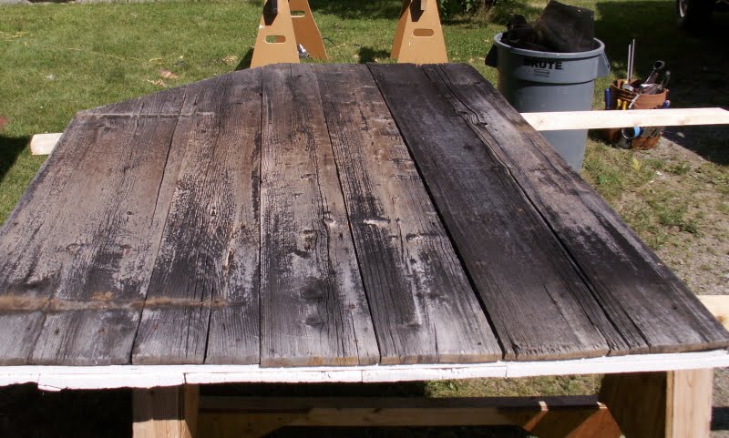
In order to replace the rotten plywood I had to completely disassemble the door. I decided to take the opportunity to make a few design changes. I also made the new plywood core from two pieces, but oriented the seam horizontally. This way the two layers of barn boards would act as battens to hold the door together. The cracked inner sheathing board was 17-inches wide. To get a replacement I dug around in the carpenter shop attic until I got one I liked, ripped it to width and cut it to length (Yes, it was too wide at 18.5 inches!) I laid out the interior boards on my saw horses with the whitewashed inner faces down and glued and screwed the new plywood to them with construction adhesive and short decking screws:


I had attached a strip of Vycor self-adhesive rubberized flashing tape to the top edge of the plywood core, first sticking it to the inner face and leaving the release paper on the rest of the strip. After fastening the plywood to the interior boards I covered the outer face of the plywood with tar paper and lapped the Vycor over the top:
This way, any water that drips from the roof will run over the Vycor and down the tar paper rather than soaking into the plywood core. I nailed the exterior boards on over the tar paper, again using square nails:
I then flipped the door over and replaced the square nails in the interior boards. The edges of the door got capped with strips of wood to hide the Vycor and plywood end-grain. The finished door looks like a 100+ year old barn door made of two layers of vertical boards held together by clinched square nails...that it has a structural core of plywood waterproofed with Vycor will be a secret between you and I...

Fixing such damage is only a temporary repair unless the source of the problem is identified and addressed. Therefore I had to do something about the water coming off that roof. There wasn't enough room for a gutter above the door, so I made a sort of inverted drip edge from a sheet of copper with a V-shaped channel on one edge. To install it I removed the first three courses of slate from the roof:
This was relatively easy because the slates had been installed with slate hooks (usually reserved for repairs) instead of nails. My theory on this: the roofers were concerned about the uneven and flexible nature of the roof sheathing, and couldn't nail the slates for fear of them stressing and breaking over time. The sheathing boards are installed parallel to the rafters (see above), therefore the roof surface is far from flat and flexes a bit when the building is loaded with snow. Normally the sheathing would go horizontally, perpendicular to the rafters, and the slates would sit firmly over any irregularity between sheathing boards. But on the Weaving Shed the roof sags and bounces a lot between rafters, and snow on top would break the slates if they were nailed across an uneven seam, so the roofer used hooks to give the slates a greater degree of stress-free movement. There is a down-side to this method of slating which I'll discuss later. I installed the copper over the cedar shingles that formed the "drip edge", and put back the slates:
I hosed water onto the roof to test the new diverter and make sure I had it pitched downhill.
The only discernable change is the fact that the door now easily clears the threshold.


Special thanks to the Museum visitor who stopped to watch me work and ask whether they had Liquid Nails in 1850!

Thursday, June 28, 2012


The Saga of Seal and Polar Bear, Part II
The last time we met, I was telling you about a fantastic painting in the permanent collection, Seal and Polar Bear by Charles Sidney Raleigh.


I had decided to feature the work in my upcoming exhibition How Extraordinary!, but I knew virtually nothing the artist who painted it. So it was off to the books in search of the enigmatic painter.

 Charles Sidney Raleigh in his later years (Image courtesy of the Archives of American Art, Washington, D.C, http://www.aaa.si.edu/collections/images/detail/charles-sidney-raleigh-7708 ).

Charles Sidney Raleigh was born in Gloucester, England in 1830. He ran away to sea when he was ten or twelve, no one is exactly sure when. He became a merchant seaman, but other than that we don’t know much about this part of his life. 

Let’s flash forward to 1870, then, when Raleigh’s life direction changed dramatically.
While returning from a voyage to Rio de Janeiro, Raleigh and his shipmates became sick with a mysterious fever. He convalesced in Sandwich, Massachusetts, at the house of a fellow crewman. During his recovery, Raleigh fell in love with his host’s daughter, Amelia, and married her. They settled down in New Bedford Massachusetts, and had six children together. To support his growing family, Raleigh embarked on a new career as a self-taught painter. 

While painting may not seem like an instinctual choice of career after seafaring, Raleigh was a talented artist, and is thought to have executed over 1,100 works. Over 600 of these were meticulous, highly detailed portraits of ships, but he also painted murals, shops signs, and even the interior of his own house.
Coincidentally, Shelburne Museum has one of his shop signs, for Purrington and Taber:

Signboard for Purrington and Taber, Painters, ca. 1870-1880

Raleigh also painted polar bear scenes. He never visited the Arctic himself, but instead relied on the accounts of whalers and explorers to gain an understanding of the region. His polar bear paintings have an abstract, cartoonish look, but they also exude a sense of energy and excitement.

Raleigh died in 1925, having lived a long, productive life.
Now I knew a little more about the artist, but I still needed to learn about the painting itself. What would I find out? Stay tuned for Part III...


The Saga of Seal and Polar Bear, Part III

Welcome back to my continuing adventures with Seal and Polar Bear!


In my last post, I introduced you to the artist who painted this peculiar scene, Charles Sidney Raleigh. Today I’ll tell you what I’ve learned about the painting itself.

I started my research by consulting the records room in our Collections Management Building, which contains our object files.

One of the many filing cabinets dedicated to our object files.

While perusing the folder for Seal and Polar Bear, I found a reference to a second version of the painting, located at the National Gallery in Washington, D.C.
The fact that there were two versions of this peculiar work intrigued me, so I grabbed our library’s copy of the National Gallery’s catalogue of American vernacular painting. 

Law of the Wild, 1881 (image courtesy of the National Gallery, Washington D.C.)

The version at the National Gallery is called Law of the Wild, but it’s the same basic composition, and was executed in 1881, the same year as Seal and Polar Bear. That wasn’t all I learned, however. While reading about Law of the Wild, I saw a reference to a third version of the painting.

Wait, there’s a third version?

According to the catalogue, an image of this third painting is kept in Raleigh’s artist file, which is located at the Archives of American Art in Washington, D.C. Fortunately, a microfilm copy of Raleigh’s file can be accessed at the Boston Public Library, and so I took a research trip to look at it.

I hadn’t visited the library before, but its grand, Italianate façade made it easy to find. 

The exterior of the Boston Public Library, designed by architect Charles McKim and completed in 1895.


The interior of the library is as grand as its exterior.


The library is famous for its murals by John Singer Sargent.


After I had explored the library, I settled down with the Raleigh’s microfilm reel, and found two photographs of the painting. 


 The date 1886 had been written on the pictures, which suggested that this version had been painted five years later. Unfortunately, the pictures were small and blurry, so I wasn’t sure whether I was really looking at a third version of the painting, or just a poor, misdated photograph of one of the two known versions.

I found a note mentioning that this third version had last been seen at the Bourne Archives in Massachusetts, which was now part of the Bourne Historical Society. I called and asked whether the Historical Society had a painting called Seal and Polar Bear in its collection.

“Why yes,” the archivist answered, “I’m looking right at it.”

Seal and Polar Bear, 1886 (Image courtesy of the Bourne Historical Society)

The archivist generously sent me pictures, and once I had them, it was easy to see it was a different painting, with very jagged icebergs and a seal whose mouth resembled a beartrap.

I was excited to see this third version, but it raised new questions. Why would Raleigh paint three versions of the same composition, for example, and who was the intended audience? There is a story waiting to be told here, and if I had all the time in the world, I’d tackle it. I had an exhibition to prepare, however, so I needed to put this story on the backburner, for now at least.

Stay tuned for the conclusion of Seal and Polar Bear

Tuesday, June 19, 2012

Art on the Edge

"Is the frame original?"

Whether carved, molded, gilded or painted, picture frames can rise to the level of  works of art in their own right, and can tell us a lot about the context in which a painting was displayed, but it's rare that we know much about how a frame came to be associated with a painting it houses. Frames are not often described or included in catalogs of paintings, and it is common for collectors to change framing when they purchase a work of art or change their decor.

Not long ago, we found ourselves asking, "Is the frame original?" when Rembrant Peale's Woman with the Tuscan Hat, c. 1847 came into the lab for conservation treatment. Both the painting and frame were in dire need of cleaning and repair, so this was an excellent opportunity to look into both of them a little more deeply.

Before Conservation Treatment

After Conservation Treatment
The painting is described in inventories of the artists' studio following his death as "Tuscan Hat, from a composition after André" but there's no indication as to whether or not the painting was framed. The painting came into Shelburne Museum's collection in 1985, and to the best of our knowledge, had only been published once before in John Mahey's 1969 article in American Art Journal in which the painting is depicted, but not the frame. 

The frame itself was made in two parts: the outer rectangular decorative moldings and the inner spandrel with  an oval opening. They're held together with nails on the reverse side of the frame. Oddly, the inner spandrel is a bit small for the outer frame; it just barely fills it so that you can see its outer edge peeking out from the opening of the outer frame. It also looks like an ornamental border had been removed from the outer edge of the spandrel. While there were a few empty nail holes that didn't match up between the spandrel and outer frame, there weren't enough for me to say that either piece had been used in some other context.

The pink arrow points to  the edge of the spandrel. The green arrow shows marks made by an ornamented border that was once on the frame and the blue arrow is pointing to cotton tulle applied to the surface of the frame before it was gilded. This image was taken before conservation treatment.
The pink arrow shows a wood splint added to the outer frame's rabbet to hold the  inner spandrel in place.
There's another splint under the spandrel too. Its just a little harder to see in this picture.
The Rococo-style ornament was made using compo, rather than plaster or carved wood. Cotton tulle netting applied to the ornament prior to gilding was a popular technique in the second quarter of the 19th century. And while the spandrel doesn't fit the outer frame perfectly, the compo ornament applied at the corners compliments the decoration on the outer frame. And so the style and materials used to make the frame suggest that it may have been produced sometime between 1825 and 1850, the same period as the Peale's Woman in the Tuscan Hat.

We will probably never be certain when this frame was associated with the painting or whether the outer frame has been reused. If it isn't the first frame this painting ever had, the match is in keeping with the time that they both were made.

If I've whetted your appetite to learn more, you might be interested in these summaries of three thought-provoking talks from this year's American Institute for Conservation annual meeting which considered picture frames and framing and the challenges posed in researching them.

Thanks to conservation department volunteer intern Linzy Vos who performed the conservation treatment of this frame and contributed to the research. Thanks also to paintings conservator Pamela Betts who researched and performed the conservation treatment on the painting as part of an Institute for Museum and Library Services Conservation Project Support grant.

Thursday, June 14, 2012

Teaching Shelburne Museum II: A Centennial Expo

A few weeks back I wrote about a partnership between Shelburne Museum, the Green Mountain Writing Project, and Turning Points in American History that encourages Vermont educators to use primary sources, including museum collections, when studying the Civil War and Reconstruction era. I promised to share more about the study group that meets at the Museum, including innovative ways that participating teachers are engaging their students with history. I had to look no further than the 1876 World's Fair, which arrived at the Museum on a sunny day this spring.

"Lamb & St. Lawrence Leech Co.," presented by Vermont educators Jennifer Theoret (pictured) and Cate Lamb, advertised historical remedies in the Apothecary Shop.
The Turning Points educators modeled their Centennial Exposition after National History Day, a competition in which students study a historic topic using a variety of primary and secondary sources and present their research in the form of a paper, performance, exhibit, website, or documentary. Our educators set up temporary exhibits around the Museum grounds on nineteenth-century topics including needlepoint samplers, the history of footwear, and Civil War-era amputation. 

They brought to life several objects that I had seen before but never studied, such as this prosthetic leg on display at the Doctor's Office upstairs in the General Store. I learned that amputations were increasingly common in the Civil War as a result of military advancements like the minie ball, a particularly destructive lead bullet used by the Union army. The Turning Points teachers also made compelling connections, as in the needlepoint display that linked the content of early American samplers to the unique roles that women played in the abolitionist movement. I was surprised to discover that explicit anti-slavery inscriptions appear on textiles dating as early as the 1830s.
A prosthetic leg at the General Store.
Each exhibit included a detailed lesson plan relating to the content of the exhibit to the elementary, middle, or high school classroom. My visit to the 1876 World's Fair was a unique opportunity to see Shelburne Museum's collection from a different angle, and it opened my mind to ever-new teaching possibilities. Stay tuned for a post about the Green Mountain Writing Project's role in this unique collaboration. Thank you, Turning Points!

Wednesday, May 30, 2012

A good trick

I  love working with the curatorial fellows because, invariably, they have a knack for picking objects for their exhibitions that haven't been out on view in a long time. Curatorial fellow Sara Woodbury has chosen a some truly wonderful works for her exhibition on imagined worlds, How Extraordinary! Travel, Novelty, and Time in the Permanent Collection, opening in Webb Gallery June 16.  Sara was in the lab to look at one of these, and we both were so amazed by it, we thought we should share it here too.

Maker unknown, Trompe-l'oeil map, Collection of Shelburne Museum, 27.18-6
It is unknown who made this trompe-l'oeil arrangement of a map of North America written in French and other printed matter and objects. What's so amazing is that it was executed in ink using a pen with watercolor applied with a brush. There's no printing. The support, the material that the work was produced on, is a laid paper, but what look like indentations from a printing plate aren't. They were created with watercolor and a brush. We were examining the work to see if it made sense to treat it to reduce that yellow tonality. In fact, we discovered that the paper was toned to look old. Fake age!

A real red-rimmed paper label on the back of the framing indicates that the work is French and was made in 1779.  I'll leave you with some details and photo micrographs to enjoy, but this really needs to be seen to be believed.
The artist played with depicting the distortion caused by lenses in the lunettes.
At 60x magnification you get a better sense of the rendered optical distortion through the lens. The letters get bigger and the color changes.

A better look at those fictional plate marks.

The depicted plate mark flattens out under 60x magnification. Aren't those rose-head nails lovely?